In a world saturated with information, the ability to present data clearly is no longer a niche skill, it's a critical business competency. Effective data visualization transforms complex datasets from overwhelming spreadsheets into compelling stories that drive understanding, reveal insights, and inspire action. However, a poorly designed chart can do more harm than good, creating confusion, fostering misinterpretation, and ultimately leading to flawed decisions. This guide cuts through the noise to provide a definitive, actionable list of data visualization best practices.
We've compiled seven foundational principles that will elevate your work. You'll learn how to select the perfect chart for your specific dataset, strategically use color to guide your audience's attention, and provide the essential context that turns raw numbers into a meaningful narrative. Whether you're a digital marketing professional analyzing campaign performance, an e-commerce manager tracking sales trends, or a data analyst presenting to stakeholders, mastering these techniques is essential. These aren't just design tips; they are core tenets for communicating with data accurately and persuasively. Let's dive into the rules that separate a confusing graph from a crystal-clear masterpiece of data communication.
1. Choose the Right Chart Type for Your Data
Selecting the right chart is the foundational step in effective data visualization. It's the visual equivalent of choosing the right words; the format you select directly influences how easily your audience can understand the story your data tells. The core principle is to match the chart type to both the nature of your data and the specific insight you want to communicate, a cornerstone of data visualization best practices.
Choosing an inappropriate chart can obscure meaning or, worse, mislead your audience. For example, using a pie chart to show trends over time would be confusing, while a line chart is perfectly suited for that task. Pioneers like Edward Tufte and Cole Nussbaumer Knaflic have long emphasized that the goal is clarity and precision, which begins with this fundamental choice.
How to Select the Right Chart
Your decision should be driven by what you want your audience to do with the information. Are you showing a relationship, a comparison, a distribution, or a composition?
- For Comparisons: Use bar charts to compare distinct categories, like sales figures across different product lines.
- For Trends Over Time: Line charts are ideal for displaying continuous data over a period, such as website traffic over a year.
- For Relationships: Scatter plots excel at showing the correlation between two different variables, like ad spend versus conversion rate.
- For Composition: Use pie or donut charts sparingly to show parts of a whole, but only for a few categories (five or less) to avoid clutter.
The following decision tree simplifies this selection process by focusing on your data type and your primary goal.
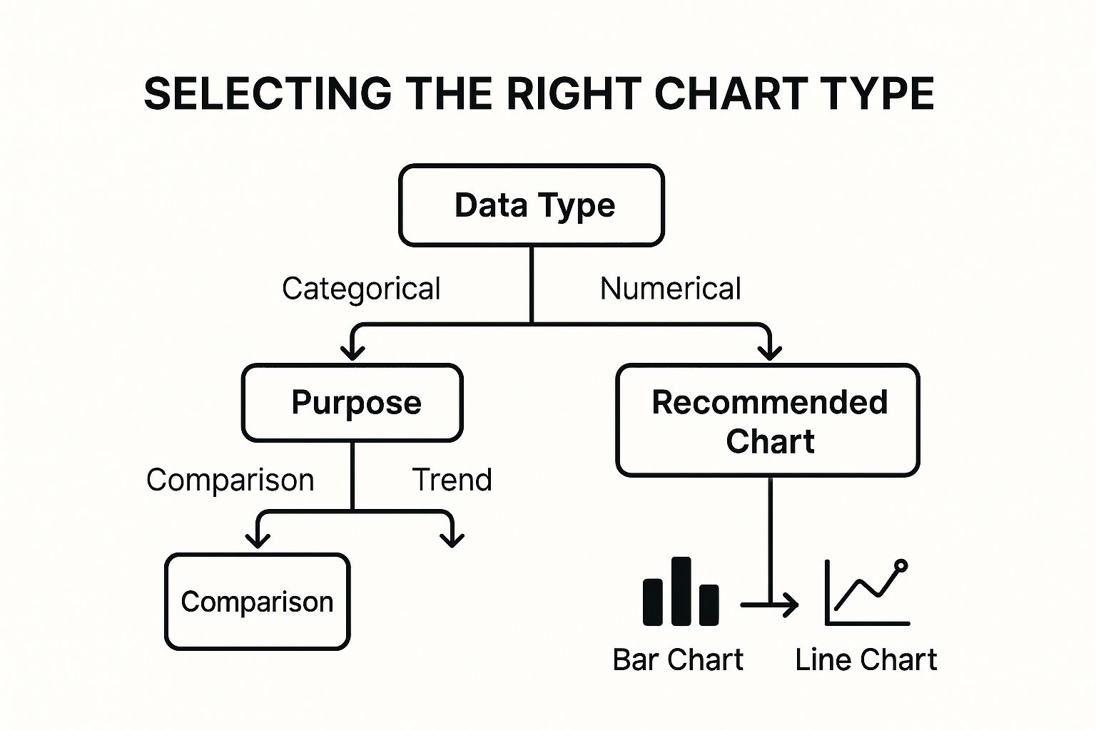
This flowchart illustrates that starting with your data type (categorical or numerical) and then identifying your purpose (comparison or trend) quickly leads to a suitable chart recommendation. For e-commerce businesses, applying this logic is critical; you can learn more about how to apply these charts in our guide to e-commerce data analysis. This structured approach removes guesswork and ensures your visualization serves its intended function, making your insights immediately accessible.
2. Maintain High Data-Ink Ratio
Maximizing the "data-ink ratio" is a core principle for creating clean, effective visuals. This concept, introduced by data visualization pioneer Edward Tufte, prioritizes dedicating the majority of a chart's ink or pixels to displaying actual data information. The goal is to strip away any non-essential visual elements, often called "chart junk," that can distract from or obscure the core message.
Adhering to this practice ensures that every element on your chart serves a purpose. By removing visual clutter like unnecessary gridlines, borders, or decorative effects, you direct your audience's attention straight to the data's story. This minimalist approach is a fundamental tenet of modern data visualization best practices, seen in the clean dashboards of Google Analytics and the focused economic charts of the Financial Times.

How to Improve Your Data-Ink Ratio
Applying this principle requires a critical eye and a commitment to simplicity. Before finalizing any chart, review each component and ask: "Does this element help communicate the data?" If the answer is no, it should be removed. This process enhances clarity and makes your visualizations more impactful.
- Remove "Chart Junk": Eliminate 3D effects, shadows, background patterns, and any purely decorative elements. These features add visual noise without contributing to data comprehension.
- Simplify Axes and Gridlines: Mute or remove heavy gridlines, keeping only those essential for context. Often, a single y-axis or light horizontal lines are sufficient.
- Use Direct Labeling: Whenever possible, place data labels directly on the chart elements (e.g., at the end of a line or on a bar) instead of relying on a separate legend. This reduces the cognitive load on the viewer.
- Choose Clean Fonts: Stick to a single, simple, and legible typeface. Avoid using multiple fonts or overly stylized lettering that can distract from the data itself.
By focusing on a high data-ink ratio, you create visualizations that are not only aesthetically pleasing but also far more effective at communicating information quickly and accurately. This disciplined approach ensures your chart's primary function remains to inform, not just to decorate. For those in marketing, this can be the difference between a campaign report that drives action and one that causes confusion; learn more about applying these principles in our guide to marketing data visualization.
3. Use Color Purposefully and Accessibly
Color is one of the most powerful tools in data visualization, capable of instantly drawing attention, grouping related elements, and evoking emotional responses. Using it purposefully means moving beyond aesthetics to guide your audience's interpretation of the data. The core principle is to apply color strategically to highlight key insights and create intuitive associations, a crucial aspect of data visualization best practices.
Applying color without a clear plan can lead to confusion and misinterpretation. A chart with too many colors overwhelms the viewer, while inconsistent color usage can break logical connections between data points. Experts like Cynthia Brewer, creator of ColorBrewer, have established frameworks for using color effectively and, most importantly, accessibly. The goal is to ensure your visualization is clear and readable for everyone, including those with color vision deficiencies.

How to Apply Color Effectively
Your color choices should always serve the data's story. Use color to encode meaning, not just for decoration. For example, in a dashboard tracking sales performance against targets, using green for "met or exceeded target" and red for "below target" provides an immediate, intuitive understanding.
- To Highlight: Use a single, bright, or contrasting color to draw attention to the most important data point in your visualization, such as your company's performance compared to competitors.
- To Show Categories: Assign distinct, easily distinguishable colors to different categories in a bar or pie chart. However, limit your palette to 5-7 colors to avoid cognitive overload.
- To Represent Magnitude: Employ a sequential color scale (e.g., light blue to dark blue) to show a range of values, such as low-to-high customer engagement. This is commonly seen in heat maps.
- To Ensure Accessibility: Choose color palettes that are perceivable by people with colorblindness. Tools like ColorBrewer and Tableau's built-in accessible palettes are designed specifically for this.
This deliberate approach to color ensures your visuals are not only aesthetically pleasing but also functional and inclusive. By combining color with other visual cues like labels, patterns, or icons, you can create a robust visualization that communicates its message clearly to the widest possible audience.
4. Provide Clear Context and Annotations
A visually appealing chart is useless if the audience doesn't understand what it represents. Providing clear context is a fundamental data visualization best practice that ensures your graphic is self-explanatory and maintains its integrity, even when viewed outside its original context. Essential elements like titles, axis labels, and data sources act as a user guide, preventing misinterpretation and building trust with your audience.
Without this crucial information, viewers are left to guess the story behind the data. Imagine a line chart with unlabeled axes; is it showing revenue over months, or website visitors over days? Contextual elements remove this ambiguity. This practice has been championed by journalistic standards, such as those used by The Economist, and popularized by storytellers like Hans Rosling, who masterfully used annotations to make complex global trends understandable.

How to Add Effective Context
Your goal is to anticipate and answer your audience's questions before they even have to ask them. Good context transforms a simple chart into a credible, insightful piece of analysis. Start by adding the foundational elements and then use annotations to highlight key takeaways.
- Use Descriptive Titles: Instead of a generic title like "Sales Data," opt for a title that summarizes the key finding, such as "Q3 Sales Growth Driven by New Product Launch."
- Label Everything Clearly: Label both the X and Y axes with descriptive names and include the units of measurement (e.g., "Revenue in USD," "Number of Units Sold").
- Cite Your Sources: Always include a note specifying the data source and the collection date (e.g., "Source: Google Analytics, Jan 1 - Mar 31, 2023"). This builds credibility.
- Add Strategic Annotations: Use text callouts or arrows to highlight significant events, outliers, or milestones. For example, pointing to a spike in a sales chart and adding a note like "Corresponds with Black Friday promotion" provides immediate insight.
By adding these layers of information, you empower your audience to understand the data's scope, relevance, and key stories. This approach ensures your visualization is not just a picture, but a complete and compelling narrative that stands on its own.
5. Design for Your Target Audience
A visually stunning dashboard is useless if the intended audience cannot understand it or act on it. Designing for your target audience means tailoring the complexity, style, and content of your visualization to match their specific needs, knowledge level, and context. This human-centered approach transforms data from a collection of numbers into a tool for decision-making and is a fundamental component of data visualization best practices.
Failing to consider your audience can lead to confusion and disengagement. A detailed, granular dashboard designed for a data analyst will overwhelm an executive who needs high-level KPIs for a quick strategic overview. The principles of user experience (UX) design teach us that effectiveness is measured by the user's ability to achieve their goals, which starts with understanding who that user is.
How to Design for Your Audience
The core principle is to align the visualization's design with the audience's purpose. What decisions do they need to make? How much time do they have? What is their level of data literacy? Answering these questions will guide your design choices.
- For Executives: Focus on high-level, aggregate KPIs. Use simple charts like scorecards, gauges, and clear bar charts that communicate status and performance against goals at a glance. The priority is quick comprehension.
- For Analysts: Provide detailed, interactive dashboards. Use complex charts like scatter plots, heatmaps, and allow for filters, drill-downs, and data exploration. The goal is to facilitate deep-dive analysis and discovery.
- For the General Public: Use simple language, universal icons, and a clear narrative. Infographics that tell a linear story are highly effective. Avoid jargon and complex chart types that require specialized knowledge.
To truly resonate with your audience, you must understand their perspective. The best way to achieve this is by gathering direct feedback and creating user personas. You can discover more about using customer insights for impactful analytics to inform your design process. This targeted approach ensures your visualization not only presents data accurately but does so in a way that is meaningful and actionable for the people who use it.
6. Maintain Truthfulness and Avoid Misleading Elements
Ensuring your visualizations are truthful is the most critical ethical responsibility in data communication. This practice involves accurately representing the underlying data without distorting proportions, manipulating scales, or using design elements that could lead to misinterpretation. The goal is to present information honestly, which builds trust and maintains credibility with your audience, a fundamental aspect of data visualization best practices.
A misleading visualization can do more harm than no visualization at all, as it can actively guide your audience to incorrect conclusions. For instance, truncating a Y-axis on a bar chart can exaggerate differences, making a minor fluctuation look like a dramatic event. Data visualization experts like Edward Tufte have long advocated for graphical integrity, where the visual representation is directly proportional to the numerical quantities it represents.
How to Ensure Your Visualizations are Honest
Your primary goal is to represent the data with integrity, letting the numbers speak for themselves without deceptive visual tricks. This requires a conscious effort to adhere to standards that prioritize clarity and accuracy over sensationalism.
- Always Start Bar Chart Axes at Zero: Truncating the Y-axis (not starting at zero) dramatically exaggerates the differences between bars. Unless you have a compelling and clearly stated reason, a bar chart’s baseline must be zero.
- Use Consistent Scales: When placing charts side-by-side for comparison (e.g., sales in Q1 vs. Q2), use the exact same axis scale for both. Inconsistent scales make it impossible to draw accurate visual comparisons.
- Represent Proportions Accurately: In area-based charts like bubble charts or treemaps, ensure the area of the shape is directly proportional to the value it represents. Avoid using 3D effects, as they distort perspective and make accurate comparisons difficult.
- Clearly Label Uncertainty: When visualizing statistical data, such as survey results or scientific findings, include error bars or confidence intervals. This transparency communicates the range of potential values and the uncertainty inherent in the data.
Adhering to these principles, as seen in the stringent requirements of scientific journals and news organizations like Reuters, ensures your visualizations are not just beautiful but also ethically sound. For any business, especially in e-commerce where decisions are data-driven, presenting data truthfully is non-negotiable. It ensures that strategic choices are based on a clear and accurate understanding of performance, from customer behavior analytics to sales trends. This commitment to honesty underpins every other best practice in creating effective data visualizations.
7. Optimize for Interactivity and User Experience
Static charts can present a single viewpoint, but interactive visualizations transform your audience from passive observers into active explorers. This approach involves designing responsive dashboards that allow users to filter, drill down, and customize their views to uncover insights on their own terms. Optimizing for interactivity is a key data visualization best practice that significantly boosts engagement and comprehension.
Making a visualization interactive means balancing powerful functionality with intuitive usability. The goal is to enhance understanding, not complicate it with confusing controls. When done correctly, interactions like hovering for tooltips or filtering by date range make complex datasets more accessible. Pioneers like Mike Bostock with D3.js and major business intelligence platforms like Tableau and Power BI have demonstrated how interactivity can turn data into a compelling, hands-on experience.
How to Implement Effective Interactivity
Your focus should be on creating a seamless user journey that encourages exploration. The interactive elements should feel natural and add value rather than becoming a distraction.
- Filter & Drill Down: Allow users to isolate specific segments of data. For example, a sales dashboard could let users filter by region, product category, or time period, and then drill down into city-specific performance.
- Hover for Details: Implement tooltips that appear when a user hovers over a data point. This keeps the main view clean while offering granular details on demand, such as exact sales figures or percentage changes.
- Customize Views: Give users the power to change chart types or switch the metrics being displayed. This caters to different analytical needs within the same audience.
- Provide Clear Feedback: Ensure every interactive element provides a visual cue. A button should look pressed, a selected filter should be highlighted, and loading indicators should appear when data is being refreshed.
The video below offers a deeper look into designing intuitive and powerful interactive dashboards.
By empowering users to ask and answer their own questions, you make your data more relevant and memorable. This level of engagement is crucial for making informed decisions, which is why we explain how these insights drive results in our guide to understanding data-driven campaign optimization. This approach ensures your visualization is not just a static report but a dynamic tool for discovery.
7 Best Practices Comparison
| Aspect | Choose the Right Chart Type ⭐🔄💡📊 | Maintain High Data-Ink Ratio ⚡⭐💡📊 | Use Color Purposefully and Accessibly ⭐💡📊 | Provide Clear Context and Annotations ⭐💡📊 | Design for Your Target Audience ⭐🔄💡📊 | Maintain Truthfulness and Avoid Misleading Elements ⭐💡📊 | Optimize for Interactivity and User Experience ⭐🔄⚡📊 |
|---|---|---|---|---|---|---|---|
| Implementation Complexity 🔄 | Moderate complexity; requires data understanding and matching chart types | Low to moderate; focus on reducing non-essential elements | Moderate; involves careful palette and accessibility choices | Low to moderate; adding clear labels and annotations | Moderate to high; needs audience analysis and customization | Moderate; requires strict adherence to ethical standards | High; involves coding interactive features and UX design |
| Resource Requirements ⚡ | Requires skilled data analysts and designers | Minimal technical resources; focused on design refinement | Moderate; tools for palette testing and design | Minimal; effort in researching and adding context | Moderate; research and testing resources needed | Moderate; time for validation and review | High; development time, performance optimization needed |
| Expected Outcomes 📊 | Accurate, clear visual representation matching data types and goals | Clean, uncluttered visualizations improving comprehension | Accessible, intuitive visuals enhancing recognition | Self-explanatory charts reducing misinterpretation | Highly tailored visuals increasing engagement and insight | Trustworthy, ethical data communication | Engaging, customizable, and interactive data exploration |
| Ideal Use Cases 💡 | Any data visualization needing clarity and correctness | Visualizations requiring clarity and professionalism | Visuals requiring accessibility and strong color meaning | Reporting needing transparency and explanation | Visualizations targeting distinct user groups | Ethical reporting and scientifically sound presentations | Interactive dashboards and dynamic reporting tools |
| Key Advantages ⭐💡 | Maximizes comprehension; reduces misinterpretation | Increases focus on data; removes clutter | Enhances accessibility; supports colorblind users | Builds trust; provides necessary context | Improves communication effectiveness; reduces cognitive load | Ensures integrity; protects audience from misinformation | Supports user-driven insights; increases engagement |
Turning Your Data into Decisive Action
Moving from raw data to impactful business decisions is a transformative journey, and the principles we've explored are your roadmap. Mastering these data visualization best practices isn't about memorizing rules; it's about internalizing a new way of thinking. It's about approaching every dataset with a clear purpose and a deep sense of responsibility to your audience. The goal is no longer just to present numbers, but to craft a compelling, truthful, and understandable narrative that guides your team toward intelligent action.
Think of each practice as a critical tool in your analytical toolkit. Choosing the right chart type is like selecting the correct lens to bring your data’s story into focus. Maximizing the data-ink ratio is the art of decluttering, ensuring every pixel serves a purpose and the core message shines through without distraction. Purposeful color isn't just decoration; it's a powerful psychological cue that directs attention, highlights critical patterns, and makes your visualizations accessible to everyone.
From Information to Insight
Ultimately, the most effective visualizations are those that bridge the gap between information and insight. This is where context, audience awareness, and truthfulness become paramount.
- Provide Clear Context: Annotations and labels transform a confusing chart into a self-explanatory guide. They answer the "so what?" before the audience even has to ask.
- Design for Your Audience: A dashboard for a sales strategist analyzing weekly performance will look vastly different from one designed for a CEO reviewing quarterly growth. Tailoring the complexity and focus ensures your message resonates and is immediately useful.
- Maintain Truthfulness: Honesty in data presentation builds trust. By avoiding misleading axes, cherry-picked data, or deceptive visual elements, you establish your credibility and ensure decisions are based on reality, not illusion.
Embracing interactivity elevates your role from a presenter to a facilitator of discovery. When users can filter, drill down, and explore the data for themselves, they become active participants in the analytical process. This fosters a deeper engagement and allows them to uncover insights relevant to their specific questions.
By consistently applying these data visualization best practices, you empower your organization to move beyond simply observing data to actively using it as a strategic asset. You equip your e-commerce team, marketing professionals, and sales leaders with the clarity needed to identify opportunities, solve complex problems, and drive tangible growth. The result is a data-fluent culture where every chart is a catalyst for a smarter, more decisive action.
Ready to apply these principles without the manual effort? ApusNest automatically analyzes your e-commerce sales data to find hidden product connections and presents them in clear, actionable reports. Discover what your customers buy together and boost your sales by visiting ApusNest to start your analysis today.
Article created using Outrank